Programming examples coming soon

Over the course of my work in the Game Maker Community’s Q&A section, I have ended up creating a whole bunch of scripts and example files. Since I create far more examples than I do actual games, I figured I should start uploading them here.

I’ll have to polish some of them first, and my use of time is notoriously bad, but eventually you’ll be able to view them in a new section on this blog. 😛

Stay tuned.

BIONICLE Fighter v16.1

If you enjoy getting wrecked by boss fights, this just might be the update for you! Oh, and we got a new enemy type and a new weapon, too.

Download (Windows executable, 72.07 MB, packed in ZIP format)

Click to download from Dropbox

Screenshots:

Click the thumbnails to view full size.

News/bug fixes in version 16.0:
– New map: Kini-Nui and Mangaia combined.
– New boss fight: Makuta Teridax. Found in the Mangaia portion of the joint map.
– Boss fight with Rahkshi moved from Kini-Nui to joint map. Defeating them opens the way into Mangaia.
– Boss fight with Toa Mata moved from Ta-Koro to Kini-Nui.
– New Rahi enemy: Nui-Jaga. A few of them appear in Onu-Koro.
– Made bots use the new Plant Life secondary attack.

Updates in version 16.1:
– Toa Mata didn’t spawn properly on Kini Nui. They do now.
– Items will now spawn in the joint Kini Nui/Mangaia map.
– Fixed the gravity field preventing flying characters from exiting Mangaia, and also made it 100% certain to prevent fall damage.
– Added a column of light which lifts you out of Mangaia after the boss fight. Use it by pressing Up+Use, like you would on a teleporter.
– Fixed a few issues with the Makuta boss fight… and apparently introduced some new ones. Sorry about the mess.
– Added music for Makuta boss fight.
– New attempt at solving the Windows 8 crashes – the crashes are related to sound, so go to settings and turn on Win8 bug fix to eliminate certain troublesome sound effects for the time being.
– Nui-Jaga now spawn every 30-40 seconds in Onu-Koro.
– New weapon: Lava Launcher. Fires a stream of flames.

Sprites for an upcoming game

I’ve been busy with a lot of things lately, so to relax I figured I’d do a small game project. I haven’t actually finished a project in years. Thus this will be a very short game, involving two knights going through 3 or 4 side-scrolling levels, battling enemies along the way. The sprite below is of one of the characters.

Quick progress of a sprite from outline to final look.

Quick progress of a sprite from outline to final look.

Color variations.

Color variations.

More sprites and details coming soon, hopefully.

Interface design and other visual player feedback

In this post I will express my thoughts about good vs. bad ways of telling a player – visually – what exactly is going on in your game. I have played many games in my life, and most of the ones I like have good interfaces, while the ones I dislike have things like wonky controls, shoddy game structure, or elements that just plain don’t make sense.

“Why spend time on the interface? It’s just numbers! Gameplay is more important!”

A great amount of focus on perfecting the gameplay is of course important if you want your players to have a good time. Ideally, the game will also tell the player how things are done through its very nature. For example, in any game where the player holds a weapon we may assume that the weapon will be effective against monsters the player meets. Without a weapon, we may assume that you will have to use other methods to deal with them, or just avoid them entirely.

However, an important aspect beyond “you have a weapon” is to communicate exactly how that weapon works to the player, and also how enemy weapons work against you. Other games without a focus on fighting will need to communicate all of their mechanics to the player as well, somehow. The choices you make in how to do this may seem arbitrary, but they will have a major impact on the player’s experience. At some point you will have to tell the user that the X button makes you jump, or that holding the Shift key equals sprinting, or that right-clicking an object will make your character pick it up. In many games all you need is an icon or a string of text that gives you this information, but in others you may not want to break the players immersion by displaying an artificial text pop-up. Luckily for you, there are ways to integrate game mechanics into gameplay, such as by having the ammo counter actually be the weapon model itself.
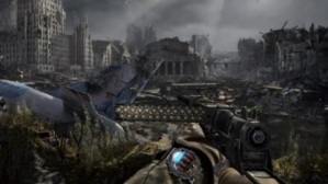
The ammunition in Metro: Last Light is shown directly as bullets in the clip, without numbers.

Screenshot from Metro: Last Light. The game is made by 4A Games, published by Deep Silver and Spike Chunsoft (Japan). Credit to PixelEnemy.com for the screenshot.


Health points and cash counts: The quintessential game stats?

You will usually have a need to tell your player how many hits the main character can take before the game is over, how many collectible coins he has in his inventory, or which areas of the game’s map that are currently accessible to him. The most obvious choice for communicating info is to write it out in plain text. Many RPGs do this. “HP 540”, for example, and that’s it.  When you take damage you can count how many hits you can take. If an attack were to do 60 points worth of damage at this point, then you would know that you had 9 hits left to take based on your health value. Other times you get something more visual in addition to the number, usually a bar. A bar shows a player in much more visual terms how much health they have and how much damage they take. If you get hit and the number jumps from 67 to 34 in a flash, you might have trouble doing the math in your head in the few instants you have to recognize the change. Did you have 70 or 50 before? How much did you lose, exactly? With a bar, it becomes clear that the remaining amount was roughly cut in half, especially if there is also a glowing effect added to the part of it that is now draining. There is also an in-between sort of display, where the health is measured in hearts or on a bar with segments. Then you can count the number of hearts you have left, but also get a visual indicator on the current amount compared to the maximum.

Finally, there is the more immerse way of showing health, in which there is no number or bar at all. Here, the character may become visibly exhausted instead, or maybe a screen effect starts tinting everything red. This is usually done where you have a small amount of total health (so that the different stages are more clear), and often where the player only has one or two hits to take (such as in Super Mario, where the three stages of health are indicated by being small, then large, and then wearing a power-up item).

Make it obvious!

In either case, make sure the player knows what is going on. Don’t have 3 unmarked bars next to health! Don’t neglect to put “Press START to bring up the Menu” somewhere in the tutorial section or on the display. You might know that the blue circle icons refer to special ability energy and that a green bar is some form of magic disease that you really don’t want, but the player could still have no idea about this. Even if you mark it in one language, someone from a different language (such as the many people who play import games) or younger kids may still not know what it means. Like, here in Norway we get mostly English games, no translation, right? Even though I learned English in school (and learned a lot of fancy words from playing video games!) I still had to ask my mother every time a game used a word I hadn’t learned yet.
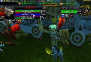
RPG HUD with unmarked bars. Without other context, the bars are meaningless.

Can you tell what those bars mean with no other information?


If you make a small icon appear next to the bars, then it becomes much more clear what they are. Super Mario 64 did this very well, too. The health meter was not visible at all when you were at full health. When you first got hit, it would appear in the middle of the screen, next to Mario, as it drained down a piece or two. Maybe 4, even, in extreme cases. Then, it would float up and stay on the screen, and now you knew that Mario’s head-shaped icon with a colored pie in it represented the damage you could take. In other games, you can guess by visuals and sound that a heart item is good for you but a skull is very very bad.
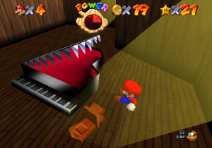
Super Mario health meter turning red when it runs low.

Mario is being attacked, and his health is clearly low. We see this from the sharp red color, the blacked-out sections, and eventually also the sounds he makes.


Even with no explanation, though, the point should have gotten across after the first few times the player sees something. If they, on the fifth failure, still do not understand why they are failing, then you have failed in your job as a designer as well. This can happen because of a language barrier, or just because the function of the item isn’t clear. For example, let’s say you are conditioned to pick up mushrooms (red and white) in Super Mario. Picking up a certain kind of mushroom (the purple and skull-marked Poison Shroom) kills you. Now, a player, even without any knowledge of this, will be able to get that the purple mushroom is bad, after the first deaths caused by it. However, the poison mushroom from Super Smash Bros. is only distinguished by a slightly darker shade of red. This is easier to miss (especially to someone with mild color blindness) and can lead to a frustrating experience if they repeatedly pick up the bad item thinking it is a nice item.

Other things, like the ability to triple-jump in SM64 by pressing A with the right timing, might really have need a text explanation. Still, even someone who did not read English could look it up the manual provided with every game cartridge, where a very nice and illustrative image showed Mario jumping, with arrows and A-button icons indicating how he did the special move. owadays, in-game tutorials may seem blatant about flashing button icons in certain contexts, but they are actually very helpful. If they were missing, I guarantee a lot of players would get frustrated very quickly. I can’t stress this enough: If you don’t have the instructions in-game, make sure that you include them somewhere else, preferably in a simple-to-understand manner. Always assume some of your players will be either unable to read the text or unable to see the image properly. Explain the action both with a small illustration (can be as simple as a picture of the Enter key next to a picture of your character pushing a crate, for example) and a short text: “Press Enter to push crates”.
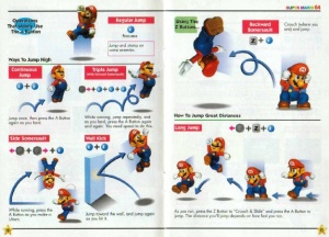
The manual for Super Mario 64 displays actions both with text and illustrations, to make sure everyone understands them.

How to jump – a clear guide that you can understand even without being able to read the text.


Enough can be too much – give options

As important as information is to the player, there is also the flip side of the coin – sometimes you make them feel like you give them too much. Sometimes, the player does not want you to show the solution by flashing “USE GRAPPLING HOOK HERE” next to an obvious target, and other times they just hate that “you’re low on health” sound effect you’ve put in. A heavily criticized character is Navi, from The Legend of Zelda: Ocarina of Time. Navi doesn’t actually interrupt your gameplay with info-dumps all that often, but her main annoyance factor is that every single time you lock on to an enemy to attack, she will make her presence known with a loud “HEY!”, “LOOK!”, “WATCH OUT!” or similar. This is meant to help you distinguish dangerous targets from other things you can lock on to, but it gets grating after a while — especially because the game already distinguishes enemy targets with a yellow targeting reticule. Once you learn that simple color code, you do not need Navi to tell you of the danger. Not everyone finds Navi annoying. I must admit, during my first playthrough of Ocarina of Time I was too engrossed with the new enemies I faced to actually notice Navi’s lock-on yell. Today, however, I have become aware and notice almost every time. Sadly, you can not turn off her voice, although that is an option that really should have been there.

In other games, you get floating markers everywhere. As useful as they could be, I didn’t like the on-screen markers in The Elder Scrolls V: Skyrim. I felt they gave away too much, and distracted me from the actual game graphics by making me stare right at the quest target even if it was behind a wall. Skyrim has an option that lets you turn them off, though, so I did. This is how things should be, ideally. Give the player the choice of getting more info, or less info. Just make sure that you always include enough info for a first-time player, and then dial it down with options for those who don’t need detailed instructions. Best of both worlds, I would say.

BIONICLE Fighter v15.0

This version doesn’t have anything major, but it does have a few new abilities for Toa. It also includes a temporary emergency fix for the crash issues some people have been having on Windows 8.

Download (Windows executable, 65.57 MB, packed in ZIP format)

Click to download from Mediafire

Click to download from Dropbox

Changes (15.0):
– Added Toa of Psionics secondary: Psionic Shield. Pushes away players and creatures, and bounces away solid objects such as rockets.
– Added Toa of Plant Life secondary: Entangle. Spruts three vines from the ground which grapples enemies and slows them down.
– Added Toa of Iron secondary: Saw Blade. Throws a spinning buzzsaw that deals extra damage to weapons and armor. Returns to the thrower like a boomerang.
– Added new style variations for Felnas (no spikes), Jutlin (pilot version), Kaukau (Faxon), Avohkii (drained version), Krahkaan (flipped), Miru (Lewa Phantoka).

Bug fixes and engine tweaks:
– Miru should no longer turn on and drain energy underwater.
– Added a button on the main menu which applies a Windows 8 hotfix. Removes Lightning Balls and multiple Exo-Pyro fireballs.
– Updated menu listings for Toa. (Also reacts to the Windows 8 fix button).
– Touched up the latest menu buttons so they have a proper color blend.

GameMaker: Studio

GameMaker Studio logo

This is the program I use to make games. It is rather easy to learn, but it still has a lot of potential for advanced 2D gaming. 3D is possible, but it’s not the main focus. If you want to make 2D games, though, this is definitely a program to check out.

The offer to get the Standard version for free has now expired.

Games made with this program include Hotline Miami – which has been a hit on Steam – as well as Spelunky and Stealth Bastard. Check out the game showcase at the offical GM:S website here:
https://www.yoyogames.com/showcase

Project AM2R – Another Metroid 2 Remake

I am a huge Metroid fan, and I have played through most of the games in the series apart from Hunters on the DS, the Pinball spinoff and the original Metroid 2. I never owned a DS to play the former, and Metroid 2 was a bit “meh” for me because it’s sort of drab. Few interesting environments, somewhat repetitive Metroid killing and cave exploring, lack of a map, etc. So therefore, it was a joyful moment when I found this on the web some months ago:

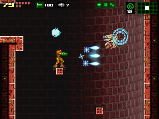
Samus Aran blasting a floating enemy with her Ice Beam power-up. Nice graphics!

Screenshot from Another Metroid 2 Remake, a fan project that has some real quality to it. Click the image to go to their page.

Link: metroid2remake.blogspot.com

Video trailer: YouTube

This project hasn’t actually received an update since last December, but for what it is it is spectacular. This must be one of the best fan games I have played. It takes Metroid 2 and remakes it in the style Nintendo used for their official Metroid 1 remake… except this somehow feels even more polished and enjoyable. It has good gameplay, nice graphics, rearranged music, some new features here and there… and it’s all fantastic.

The controls are smooth, and never have I enjoyed using the Morph Ball so much. The translation of the old Game Boy graphics and mechanics is also stellar. The sound effects fit well, and I found myself liking the basic Power Beam for once, just because of that sound. Currently the game lasts up until the boss fight with Arachnus, which is a good chunk of gameplay already. You can get many of the upgrades and fight most types of Metroid.

Definitely a project to check out if you are a fan of Metroid or just classic games in general.

BIONICLE Fighter v14.0

BIONICLE Fighter version 14 is now available. Note: A small update was released. If you downloaded this as soon as it became available, you should re-download if you don’t have version “14b”.

Download (63.52 MB ZIP)

Screenshots

Changes (14.0):
– Added button for selecting game mode to the map screen.
– Added button for selecting random or fixed bot spawns, also on the map screen.
– Added pre-match display. Allows the user to view the map via the movement keys.
– Added basic surface light system and a button to turn it on/off.
– Added Psionic primary attack: Mind Wave. Homes in on enemies and lightly impairs movement.
– The Kanohi Avohkii (Light) can now create a blinding light burst at the user’s location.
– The Kanohi Krahkaan (Shadow) can now blind nearby enemies and block out light in dark areas.
– The Kanohi Ruru (Night Vision) can now be used to view everything in dark areas, though with a green tint.
– New map: Onu-Koro, the underground village. Features dark caves, mechanical lifts and a flooded mine section where items spawn.

Bug fixes and engine tweaks:
– Added new static light object; affected by light and shadow attacks. Toa of Light may absorb energy from static lights.
– Added a button for the “show scoreboard” key in Settings.
– Bots now display names above their heads.
– Fixed a bug where embers would sometimes fail to be destroyed after fading away.
– Fixed bug with Toa bots checking the armor array for their shield HP.
– Healthbars can now be seen by everyone. Other stats are still hidden.
– Kanohi Rode and the Psionic passive ability now faintly reveals people in the dark as well.
– Mangaia spawn points now place light stands on each side of themselves.
– Removed stun from Disk Launcher, added higher damage and longer cooldown.
– Spawn points now refill air.
– Updated Toa Mata boss trigger to use button input.

So, Minecraft

The Minecraft logo.


Yeah, I totally play this from time to time. Usually I start a Survival world, then get tired with the BS that is MC Survival, and switch to Creative for an epic build instead. Then I
– abandon the build halfway through
– go to find a multiplayer server
– get fed up with the BS that is MC multiplayer ;D
– repeat process from the beginning.

Still, sometimes I do things I feel like taking screenshots of, so I might as well show off here.


For reference, the game itself can be found here:
Minecraft.net

The texture pack I am using in some of my screenshots is called Sphax PureBDcraft, and can be downloaded for free here:
BDcraft.net


Click the images to enlarge and view full size.


A castle built on a basic flat grass world.

A castle that went a bit overboard.

This was originally meant to be just a small 8×8 square where I would test out how much I could fit into such a small space. After building one room I built another, and eventually I had a castle.


The main characters from the webcomic Eight Bit Theater.

The main characters from the webcomic Eight Bit Theater.

The crazy crew from Eight Bit Theater. Actually, the sprites are from the first Final Fantasy game on the good ol’ NES. I picked these 4 to replicate in MC due to the webcomic, though.


White Mage from Final Fantasy 1, in Minecraft.

A White Mage sprite, reconstructed in Minecraft.

Ah, yes. What would the Light Warriors be without a White Mage to heal them whenever they get hurt? Any healer’s patience may run thin after a while, though.


One of my friends in Minecraft. Both he and his horse wears golden armor.

One of my friends in his old Minecraft skin.

A friend of mine in all his Minecraft glory, He is one which I have been on several servers with, and together we have built a few nice things.


A red-haired girl playing Skyblock Minecraft.

Place me and this girl on Skyblock, and it will probably end in disaster.

Another friend of mine, a girl with a knack for Minecraft Skyblock. Most of the floating islands we have built on eventually exploded, though. Totally not our fault, oh no!


A semi-circular arena built in Minecraft, modeled after Roman arenas.

What is a multiplayer game without an arena to duke it out in?

Me and my aforementioned friend built this arena on a local LAN game I hosted. We felt the need to use the desert setting for what it was worth, and a Roman arena is what we ended up with. I took about an hour or two to lay Redstone wire between the arena doors and the spectator booth, so the match can be controlled by an arena assistant.

After this screenshot was taken, we also decked out the entrance with some statues, and added a fireworks-and-flower launcher to the roof of the “emperor’s seat”.


To ease the somewhat tedious work on that arena, I had this song playing the background:

Glory of The Empire by Circus Maximus.

Spotify link
YouTube link

An awesome song. Well worth a listen, I would say.

Progress update

Map in progress: Onu-Koro, the underground village. From the various BIONICLE media that have been shown, we know that the village resides in a big cavern accessible by a few large tunnels. Some lead to the surface, some act as passages to other villages, and at least one leads into the Great Mine. The mine has several lifts to carry workers and cargo up and down, and these things may represent the peak of technology on the island.

Photoshop mock-up.

Link to feature description. (451.29 KB, JPG)

New abilities: Masks of light, shadow and night vision to go with the light engine I’m adding. Other things include a Psionic wave attack.